Sunday, April 6, 2014

The Advertising of Armando Testa


After World War II “graphic designers reinvented the communicative image to express the machine age and advanced visual ideas” (Meggs, 436). The conceptual age was after World War II, which developed design for graphic designers since they thought illustration would be dead due to the emergence and growing popularity of photography. However, the conceptual age changed this. The poster began to contain ideas and concepts rather than just narrative information. This made the designer more concerned with the space of the words and the images. Inspiration came from surrealism, cubism, expressionism, and pop art. The conceptual age expanded self-expression for artists to create more personal images, styles and techniques. This age became popular in Poland, the United States, Germany, and Cuba.
            Armando Testa, who lived from 1917 to 1992, was an Italian graphic designer. He used metaphysical blends to describe the fundamental truths about the matter. Testa started out as an abstract painter, and then moved to graphic design after World War II. In Turin, he created his graphic design studio where he used surrealism language to combine the images and symbols. For example, in the Pirelli tires add, he used their recognizable symbols and words to create a poster that had an international effect on graphic designers (Meggs, 436).
Pirelli Tires Advertisement, 1954,
Armando Testa

           Testa began to create logos, packaging, posters, and labels. As his name began to become better known, he grew from his smaller clients to larger ones such as Borsalino hats. He created the Armando Testa group, which is still an advertising agency today. One of his most famous designs is the mysterious Caballero, a Mexican gunslinger. He designed many advertisements including the beer Peroni, Punt e Mes, and Pirelli tires as mentioned before (mandmglobal.com). In my opinion, these posters are attractive to look at with spatial qualities that are eye catching.
Punt E Mes, 1960,
Armando Testa

           This agency began to flourish with his wife, Lidia, and his associate, Franco de Barberis in 1956. The Studio Testa began providing specific marketing strategies, media planning and research (adbrands.net). In 1959, Armando Testa visited the United States to begin to understand the advertising.  During the 1960s, the advertising agency began to grow rapidly gaining more and more larger clients (adage.com).
           Furthermore, television adverting started to become popular. Armando Testa embarked on promoting Lavazza’s Paulista, which was the first Italian coffee distributed nationally. “Carosello” was a block of advertising in Italy, in 1957, that featured comic sketches. Testa created Caballera and Carmencita, comic characters, who were created to promote Lavazza’s Paulista (Armando-testa.eu). To me, these advertisements really seemed to catch my attention. They are very unique and get the point across.
Caballera and Carmencita, 1973,
Armando Testa
          The “Carosello” was soon replaced by the message-intensive spots we have today. Testa still promoted Lavazza’s Paulista, but he reinvented his campaign. They hired an Italian actor in 1977 and this was one of the longest-running and most successful Italian campaigns. Since their advertising became so popular, the company began to expand and moved a branch to Rome in 1980 and then Milan in 1992 (Armando-testa.eu). Testa’s company won its first Lions award at the Cannes International Advertising Festival for Lavazza, Sole Bianco Detergent and Bistfani biscuit campaigns. When Armando Testa retired, in 1985, his son, Marco, took over (adge.com).


Citations:

"Armando Testa." Advertising Age AdAge Encyclopedia RSS. Web. 06 Apr. 2014. <http://adage.com/article/adage-encyclopedia/armando-testa/98902/>.

"Armando Testa Brussels Group." Armando Testa. Web. 06 Apr. 2014. <http://www.armando-testa.eu/>.

"Global Accounts Centre Tracking Brands, Agencies and Business Wins." Armando Testa Group. Web. 06 Apr. 2014. <http://www.mandmglobal.com/global-accounts/agency-profiles/armando-testa-group.aspx>.

"Armando Testa : Marketing and Advertising Profile at Adbrands.net." Web. 06 Apr. 2014. <http://www.adbrands.net/it/testa_it.htm>.


Sunday, March 2, 2014

The Development of Otl Aicher

Otl Aicher, also known as Otto Aicher, was a co-founder of the Ulm School of Design along with Indge School, his wife, and Max Bill, a former Bauhaus teacher. Ulm School, also known as Hochschule fur Gestaltung (HfG), was a renowned school for design in 1853 until it closed in 1968. He was known for his structural visual systems and typography (Kortunov). Aicher was a great educator, author, and graphic designer.
            Otl Aicher was arrested for refusing to join the Nazis, and was involved with the “White Rose resistance movement.” This was a movement against the Nazis in Germany. Aicher also was drafted into the Germany army to fight in World War II but tried to escape many times. When he finally escaped, he went into hiding, and then studied sculpture. After he was able to study sculpture, he opened the school in Ulm. While he was developing the Ulm School, his students were involved in visual identities. This included the Braun, a turntable, and Lufthansa, an airline that asked for a logo ("Font Designer – Otl Aicher.").
Munich Summer Olympics Logo, 1972, Otl Aicher
          One of his most famous works was for the 1972 Munich Olympics under his company, Buro Aicher. He created the logo, above, for the Olympics, which was very unusual, and some people say it resembles a sun while others say a cake. Many people did not like this logo, and wondered how it connected to sports. Others complained it looked like a doodle, and did not represent the countries. I believe that it is an interesting design, but not really for the Olympics. He also created the different pictograms for each event, which showed the different motion dynamics. They were created using a grid with different visual elements. The movement shown in the photos below make them eye catching. These games were trying to present Germany in a different light than in the 1936 Berlin Olympics under Hitler’s rule. However, terrorists attacked the games, and eleven Israeli athletes were killed ("Otl Aicher and the 1972 Munich Olympics").

Munich 1972 Olympic Event Icons, Otl Aicher

Additionally, he created the first Olympic mascot, which was the multi-colored dachshund, named Waldi. Dachshunds are fast, resilient, and agile, so it made a good mascot (Kortunov). A lot could be done with the Dachshund, with graphics and 3-D which also made him a good choice, and a good figure in my opinion.
Waldi, Munich Olympic Mascot, Otl Aicher, 1972


            Another accomplishment of Otl Aicher, was his writing. He wrote several books including “The Kitchen is for Cooking” in 1982, “Walking in the Desert” in 1982, “Critique of the Automobile” in 1984, and “Inside the War” in 1985. He also created pictorial books for the companies he designed for. He used his great photography for the books and they served as public relation devices. Aicher wanted to strip the aspects of propaganda from photography and even architecture (Cinamon).
          An additional creation of Otl Aicher is the typeface, Rotis, in 1988. He named it after the city where he worked, called Leutkirch im Allgau. This means “autonomous republic of Rotis”("Font Designer – Otl Aicher"). This was the bridge between sans and serif. There are four different types: Rotis serif, Rotis semi-serif, Rotis semi-sans, and Rotis sans serif.
Rotis Typeface, Otl Aicher
           Otl Aicher was a dynamic designer, and was able to contribute significantly to the world. He was influential with his visual designs, and was able to teach that to others at the Ulm School of Design. Aicher continued to work in Rotis, his home, until he died in a tragic traffic accident on September 1, 1991 (“Font Designer – Otl Aicher”).


Biblography:
"Font Designer – Otl Aicher." Otl Aicher. N.p., n.d. Web. 01 Mar. 2014.          <http://www.linotype.com/651/otlaicher.html>.
Kortunov, Denis. "Turbomilk." The Graphics Style of the 1972 Munich Olympics -. N.p., n.d. Web.          01 Mar. 2014.
"Otl Aicher and the 1972 Munich Olympics." Otl Aicher 1972 Munich Olympics. N.p., n.d. Web.        01 Mar. 2014.
"Otl Aicher." German Graphic Designers during the Hitler Period: Biographical and      Bibliographical References by Gerald Cinamon. N.p., n.d. Web. 01 Mar. 2014.


Sunday, February 23, 2014

Surrealism


The surrealism movement influenced literature, painting, and photography in the 1920s and 1930s. It has had a unique effect on graphic design. Graphic design is often on a grid setting limits on what can be done. Surrealism artwork is considered to be haphazard and unpredictable, and it developed out of Dada during World War I. It was the way people tried to escape the harshness of reality, and this artwork was meant to be dream like creating new possibilities in life. The painting below is by Giorgio De Chirico, who had a huge influence on the Surrealist movement. This is called “The Philosopher’s Conquest” and was produced in late 1913 to early 1914. It shows how he started to embrace “implausible juxtaposition.” There are many different questions about the sizes of things in this painting. One first notices the artichokes, and then the cannon, the clock, and the train. People question the size of the train versus how big the columns are behind it.

Alice in Wonderland
Surrealism is even found throughout today’s society. ‘Alice in Wonderland’, as the film and book, is a good example of modern Surrealism. It has playing cards and white rabbits, which exist in real life; however, they defy normal logic through their roles in this story (McAra). The Queen of Hearts, after Alice falls down the rabbit hole, orders Alice’s head to be chopped off.  It is interesting that a playing card assumes such power and the decision appears random (McAra).
Surreality is not a state of solid reality; it is the state between reality and fantasy. Surrealism is an art movement, while surreality is a sphere of potentiality. If anyone has ever seen The Colbert Report, a good example is Steven Colbert’s segment “The Word” (Kaletzky) He takes a single world that means one thing and flips it to mean something else with satirical commentary on the new meaning written under it. Each time he uses the words unspoken meaning, he gives the audience a broader perspective, and uses a different voice to convey.
"The Word", The Colbert Report
 Many musical artists also convey surrealist ideas including Alice Cooper, Pink Floyd, and Lady Gaga. Lady Gaga is a very famous musician who is known for having a theatrical experience as part of her interaction with the audience. Lady Gaga says in many interviews that the stage is a celebration of what is rejected in society (Gray). The stage is considered to be her wonderland. She has the courage to freely express herself, and is a nonconformist. Being a nonconformist makes the creativeness become an unconscious reality since it is everything in society with a twist. Her concerts become a representation of what people want to do with their own lives, which is to be themselves with courage (Gray).

Lady Gaga's set, Pittsburgh 2011      
   As seen above, Lady Gaga uses art created for her by artists. This is an example of what she used in her show in Pittsburgh in 2011, and is referred to as “the fame monster.” It is a twist between reality and fantasy. This is the monster that represents the hardships that result because of the influence of fame on individuals. Her sets are reality with a twist, making them something people want to relate to.
Surrealism encompasses the dreamlike state or the unconscious that was used originally to escape from the reality of World War I. Today,  people still go to these movies, concerts, and even to museums to escape. The Surrealism movement has been an influence on art throughout the times.

Citations:
Gray, Richard J. "Join Academia.edu & Share Your Research with the World."Surrealism, the Theatre of Cruelty, and Lady Gaga. N.p., n.d. Web. 23 Feb. 2014. <http://www.academia.edu/1995056/Surrealism_the_Theatre_of_Cruelty_and_Lady_Gaga>.

KALETZKY, MARIANNE F. "All Eyes on Surrealism." The Harvard Crimson, n.d. Web. 23 Feb. 2014. <http://www.thecrimson.com/article/2006/11/2/all-eyes-on-surrealism-i-want/>.

McAra, Catriona. Surrealism’s Curiosity: Lewis Carroll and the Femme-Enfant. Papers of Surrealism, 2011. Issue 9. Web. 23 Feb. 2014.


Sunday, February 2, 2014

Art Nouveau

           Art Nouveau, which means “new art,” was very popular from the 1880s to around 1914. Art Nouveau influenced many aspects of life including architecture, applied arts, and illustration. It evolved from historicism that dominated design of the 19th century and formed a connection between Victorian clutter and modernism.
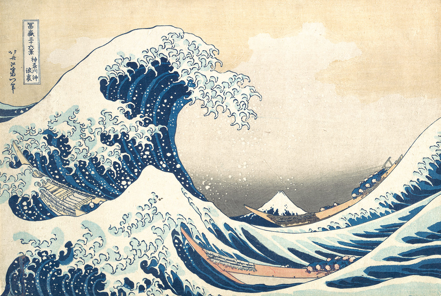
Art Nouveau was influenced by Ukiyo-e, which means “pictures of the floating world.” This was a period in Japanese art when woodblock prints, and paintings were popular. It mixed the traditional picture scrolls with decorative arts. Katsushika Hokusai was one of the more famous artists of the Ukiyo-e time period. He produced an estimated 35,000 works for several different mediums. Hokusai captured album prints, historical events, landscapes, and social behaviors. He began with “yellow-backs,” which are booklets. Hokusai created over 270 yellow-backs in his lifetime (katshushikahokusai.org).

"The Great Wave at Kanagawa" Katsushika Hokusai. 1831-1833
Source: http://www.metmuseum.org/toah/works-of-art/JP1847

           Hokusai’s most famous piece, created when he was in his seventies, was Thirty-Six Views of Mount Fuji created out of woodblocks. The process to create art from woodblocks includes cutting away where the white, or negative space is in the photo to make a template for the picture. Water based inks are used to make blends, which has to be quickly applied to the woodblock so that they do not dry before the woodblock is pressed to the paper. Artists could not see the entire design until the colors were printed on the page. This process takes a lot of skill so that everything looks just right (Department of Asian Art).
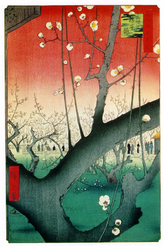
Another artist who used the woodblock system was Ando Hiroshige. This is the man who inspired European impressionists with the way he used white space, and his landscapes. Hiroshige related to ordinary people, which made his art more realistic (Department of Asian Art).

“One Hundred Famous Views From Edo” Ando Hiroshige 1857
source: http://www.ibiblio.org/wm/paint/auth/hiroshige/plum.jpg

Japanese calligraphy and silhouettes influenced Europeans. Books were developed to teach the Europeans about the Japanese techniques. It is interesting to look at two pictures side by side and see the lines, and abstract shapes. Monet was one of the impressionists that was intrigued by the woodblock prints. A Japanese bridge in his garden inspired Monet. This occupied his paintings for 20 years; he painted it at different times of day because of the beauty of the pond (Gontar).
“Water lilies and Japanese Bridge” Claude Monet 1890

There was an addition of Japanese ornaments to Art Nouveau. In earlier pieces, ornaments were just a decorative addition to the artwork, for example, on a building. Now in Art Nouveau, everything evolved around and from the ornament uniting embellishment with structure and function, which energized the design process.  “The art in Europe turned away from realism toward expressionism and modern art” (Himes). Artists like Monet and Van Gogh started to use a more “oriental art.”
            All of these artists had an interesting line and space that were inspired by Japanese art. I think it is very interesting that as technology improved, the movement of art followed. The art changed, in my opinion, for the better. Incorporating interesting and unexpected lines with novel spaces to accent the paintings makes them appealing. The era of Art Nouveau helped evolve art and how one perceived the world. It was creative and forward thinking. Monet embraced it as he started to paint details less precise and more with a fog-like presentation, termed impressionism, which I think gives them an elegant and peaceful touch. This impressionistic movement in Monet’s works made him one of the most influential artists of all time. Art was beginning to be created for the ordinary person not only the rich. This accessibility is key to an artist’s influence on culture and society and brings more culture to people to brighten their lives.


Citations:
           Department of Asian Art. "Woodblock Prints in the Ukiyo-e Style". In Heilbrunn Timeline of Art History. New York: The Metropolitan Museum of Art, 2000. Web. 02 Feb.2014. http://www.metmuseum.org/toah/hd/ukiy/hd_ukiy.htm 

           Gontar, Cybele. "Heilbrunn Timeline of Art History." Art Nouveau. Web. 02 Feb. 2014. http://www.metmuseum.org/toah/hd/artn/hd_artn.htm

           Himes, Sharon. "Influence of Japanese Art by Sharon Himes : Art History on the Art Cafe Network." Influence of Japanese Art by Sharon Himes : Art History on the Art Cafe Network. Web. 02 Feb. 2014. http://www.artcafe.net/ah/japan/index.html

           "Katsushika Hokusai Biography." Katsushika Hokusai Biography. Web. 02 Feb. 2014.
http://www.katsushikahokusai.org/biography.html

Sunday, January 26, 2014

Shepard Fairey's Controversy

           
            There has been a lot of controversy concerning the Obama “Hope” poster that was created by Shepard Fairey during Obama’s 2008 campaign. It was never Obama’s official campaign poster, but it was well received by supporters.  The controversy stemmed from the question of whether Fairey plagiarized the image from an AP photo taken by Mannie Garcia. The photo was under copyright by the AP and Fairey brought a civil suit against the AP to claim he did not violate copyright laws.  However, he destroyed evidence that implicated him and lied to the court when presenting his evidence for the case.  He was discovered by one of his lawyers and forced to admit his deceit.  He had gone to great lengths to conceal that he had indeed used the AP photo in question rather than a cropped version of another photo which would have been somewhat different.  Based on this admission, he was found guilty of lying to the court and he settled the copyright infringement accusation with the AP forcing him to pay monetary compensation.  He had made a gross error in not asking permission to use the photo and compounded it with his lies.  Copyright laws exist to protect the work of individuals from being stolen by others who might take it as their own. This was not the first piece that Shepard Fairey had been accused of plagiarizing or copying.  Other works very closely resemble pieces of other artists. For example, the “obey giant” photo by Shepard Fairey was under controversy.


Barack Obama Shepard Fairey 'Hope' Poster
Source: http://artsbeat.blogs.nytimes.com/2012/02/24/shepard-fairey-pleads-guilty-over-obama-hope-image/?_php=true&_type=blogs&_r=0


            Plagiarism is taking someone else’s work and calling it your own. In my opinion, the images look different when compared side by side.  Shepard Fairey adds his own artistic view of the photo taken by Mannie Garcia of Obama adding a political statement.  He made Obama seem like an American figure. Mannie Garcia’s original on the left, displays the president as serious and intellectual, which is different from Shepard’s. However, although the two pieces are portrayed in different artistic ways, it is the same image of Obama.
There are many photos throughout the years that are “remakes” of others. Artists compare artwork, and get inspired by different artists. They take techniques, photos, and even little parts of ideas. Sometimes this is accepted, if there is original thought.
The Fair Use Act of 1976 is for copyrighted materials. It says that certain items can be referenced if you are a student, using it for a parody, or for non-profit. A parody is the mock of a work with a comic effect. However, sometimes the lines blur between parodies and plagiarisms. How is does one tell the difference? How much original thought should their be to be a parody?
            A parody that was under controversy was Paula Sher’s photo on the right below. However, unlike Fairey, she asked permission of Herbert Matter to use the image. Herbert Matter created the original photo on the left below. This made people question art as to what it is? What is plagiarism? It made people realize that parody and plagiarism are very similar, and possibly even the same. Sher changed the tilt of the head, the colors and other small details, sort of like Shepard Fairey, how is it her own? However, the final product acknowledged all of the artists involved in the process including Herbert Matter, Paula Sher, and Terry Koppel. Since Paula Sher took copyright precautions, she did not get sued. However, the public was questioning - was this “joke” too close to the original swatch advertisement? Nevertheless, this was meant as a joke from Paula Sher, even though the public continues to question it. As shown in class, Paula Sher has many original works, and original ideas.

Source: http://retinart.net/creativity/scher-plagiarism-parody/

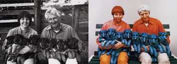
            Additionally Jeff Koonz made a sculpture (right, below) from the photo of Art Rogers (left, below). Jeff Koonz was not as careful as Paula Sher acting more like Shepard Fairey. Art Rogers sued him since the only thing changed about the photo was the color and the fact it was a sculpture. This is a very controversial subject because Koonz claims that he changed it more than others seem to realize. “If the copyright law won, then art lost” is what many seem to believe about the case.


traub-puppies3.jpg
Source: http://observatory.designobserver.com/entry.html?entry=6467


Regardless of how you look at the Obama poster, Mannie Garcia’s photo was used. There are similarities and differences between the images. To relate it to the non-art world, it is like writing a research paper but basing some of your ideas from published books. These books contain the ideas and thoughts of someone else, who you then cite in the references. Shepard Fairey was devious in his actions surrounding the use of the AP image, which also points to the suggestion that he thought what he had done was wrong.  He should have asked permission of Mannie Garcia to use his photo. Copyright laws were put into place to protect the intellectual or artistic property of their creators from those who would use them for their own gain.  This is unfair to the originator since they would not be recognized for nor profit from the new use of their work.  I believe Shepard Fairey plagiarized the AP photo of Mannie Garcia.